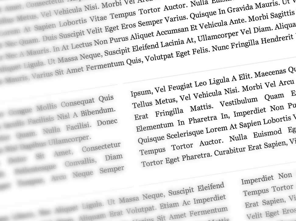
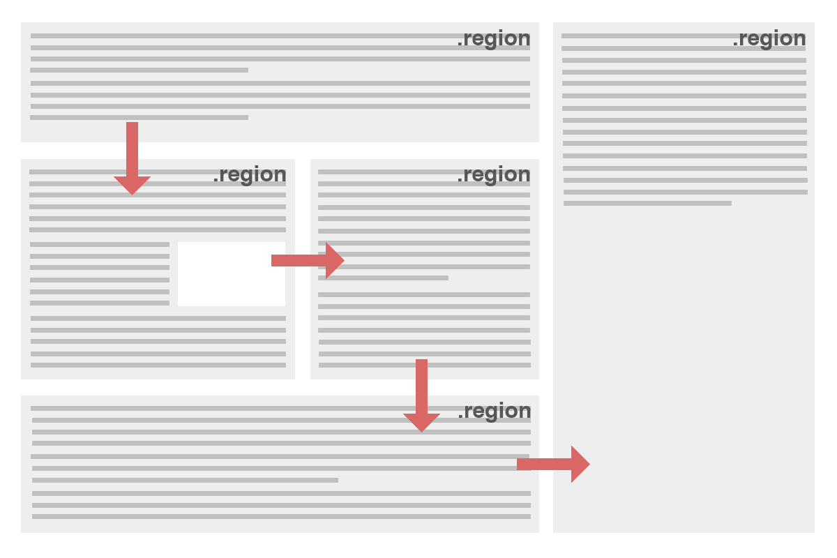
Put simply, CSS3 regions associate boxes and blocks with other blocks to allow a designer to make content flow from one box into another automatically. Previously this was impossible with just CSS. The CSS3 Regions Specification expands CSS further from a static design to a more responsive and future proof language.

What are regions
Put simply, regions are a way in CSS to allow content to flow from one box to another. This tutorial will show you how regions work according to the current specification. Currently regions are available in the nightly build of webkit and in the platform preview of IE.
Enabling Regions
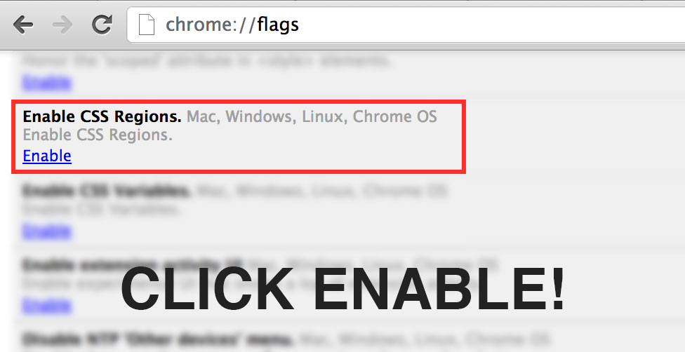
We’re going to be using Google Chrome as the web browser of choice for this tutorial as it has the greatest support for this feature. For some odd reason Chrome has regions disabled, so we need to go and enable it by going to chrome://flags

How it works
Effectively there are two key properties to a region flow. Those are the flow-in and flow-out. Now pay attention, because this can be a little tricky to wrap your head around. The basic principle is that we can allow content to flow from one block to another. The content of a specified div will go from one div to the other, ‘flowing’ between them, rather than having to put specific content in each div separately.

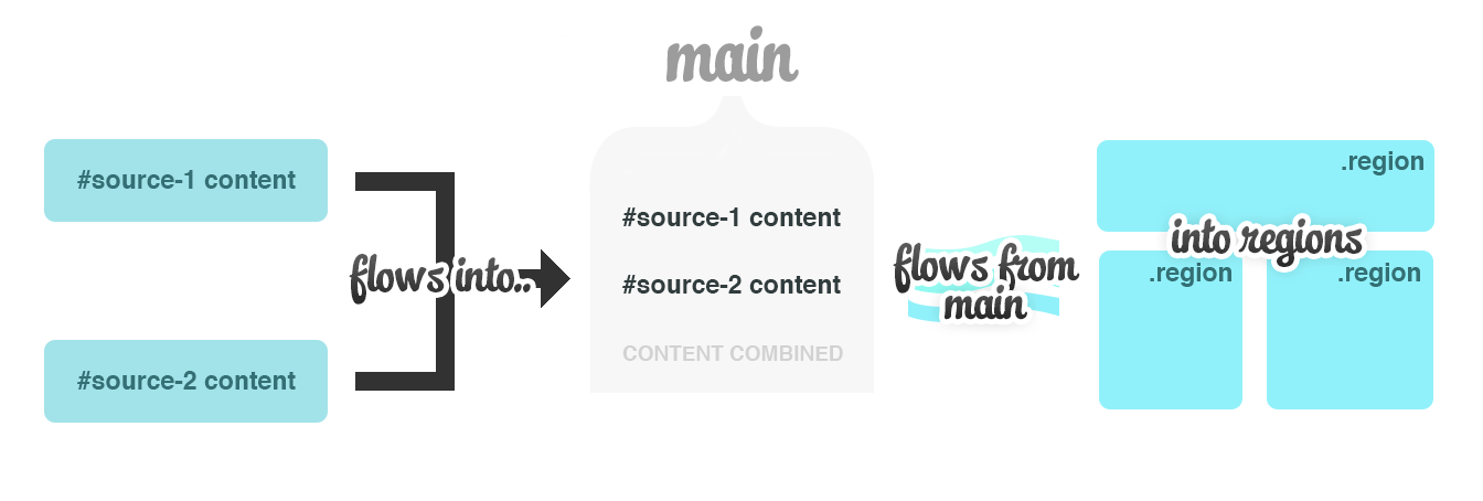
The idea is that we will have one block which contains the content, and ‘flow’ the content from that block into several other blocks. The content will still be contained within the primary container physically, but it will be diverted to flow through other block elements.
Keywords
For a flow to work we give it a keyword. A keyword identifies which items will flow into which containers. So suppose we have something like this in HTML:
<div id="source-1">
    <p> [ Really long article goes here ] </p>
</div>
<div class="container">
    <div id="region1" class="region"></div>
    <div id="region2" class="region"></div>
    <div id="region3" class="region"></div>
</div>
We can set it up so the article source will ‘flow’ into the regions. Note that the source div will effectively disappear since the content will be moved into the regions. For this particular example we’ll use the keyword ‘main’. You can use any keyword you want, it doesn’t really matter. Just make sure the content and the objects you want the content to flow into use the same keyword.
So the content will flow into this hypothetical ‘main’ container and then flow out again into the regions. Although this isn’t necessarily completely accurate it is an easy way to think about it.
#source-1 {
	-webkit-flow-into: main;
}

.region {
	-webkit-flow-from: main;
	width: 250px;
	float: left;
	margin-right: 10px;
	background: #eee;
	width: 30%;
	padding: 1%;
	margin-right: 1%;
	height: 400px;
}
You can have multiple things flowing into one container. They will appear one after the other in the flow. So you could have two sources, or other content which will be added on to the flow.

Styling the flow
It becomes very easy to style the flow containers with the @region tag. All you need to do is target the element and style as you see fit. For example, you can target the HTML in the first region in the code above like so:
@region #region1 {
    p { ... }
}
What is the benefit to using this? It means you can style content that passes through multiple regions. You could highlight the first paragraph which may appear in two regions.
An Example
To help show you exactly how this all works, lets try a simple example. We have a layout in HTML like this:
<div class="content">
    <div id="source">
        [ ARTICLE GOES HERE ]
    </div>

    <div class="one-column">
    	<div id="region1" class="region"></div>
	</div>
	<div class="three-column">
	    <div id="region2" class="region"></div>
	    <div id="region3" class="region"></div>
	    <div id="region4" class="region"></div>
	</div>
	<div class="two-column">
		<div id="region5" class="region"></div>
		<div id="region6" class="region"></div>
	</div>
	<div class="one-column-last">
		<div id="region7" class="region"></div>
	</div>
</div>
You can put the article in the .source div if you want. Make sure it’s really long! Every .region div represents a single flow of content. That means we’re going to make the content flow from one to the other. Create a CSS file and put the following in it:
body {
	font-family: Georgia, serif;
	margin: 0;
}

.content {
	padding: 2% 0 2% 2%;
}

#source {
	line-height: 26px;
	text-align: justify;
	-webkit-flow-into: main;
}

p {
	margin: 0;
	padding: 0;
	text-transform: capitalize;
}

.region {
	-webkit-flow-from: main;
	float: left;
	padding: 1%;
	margin-right: 1%;
}

.one-column .region {
	width: 96%;
	height: 200px;
}

.three-column .region {
	width: 30%;
	border-top: 2px solid #eee;
	border-bottom: 2px solid #eee;
	margin-right: 10px 1% 10px 0;
	height: 200px;
}

.two-column .region {
	width: 46.5%;
	height: 300px;
}

.one-column-last .region {
	width: 96%;
	height: 600px;
	font-weight: bold;
	font-style: italic;
}
The important lines to note are the flow from and flow into lines in .region and #source. The content flows from the source to ‘main’, and then from ‘main’ to the regions. Pretty simple, huh?
Support is currently pretty bad with you needing to enable it in chrome. The platform preview of IE also supports regions, which is a big plus. However, it is totally unrealistic that you would use this in a real life project. It is nice, though, to see what is under development in web design.

