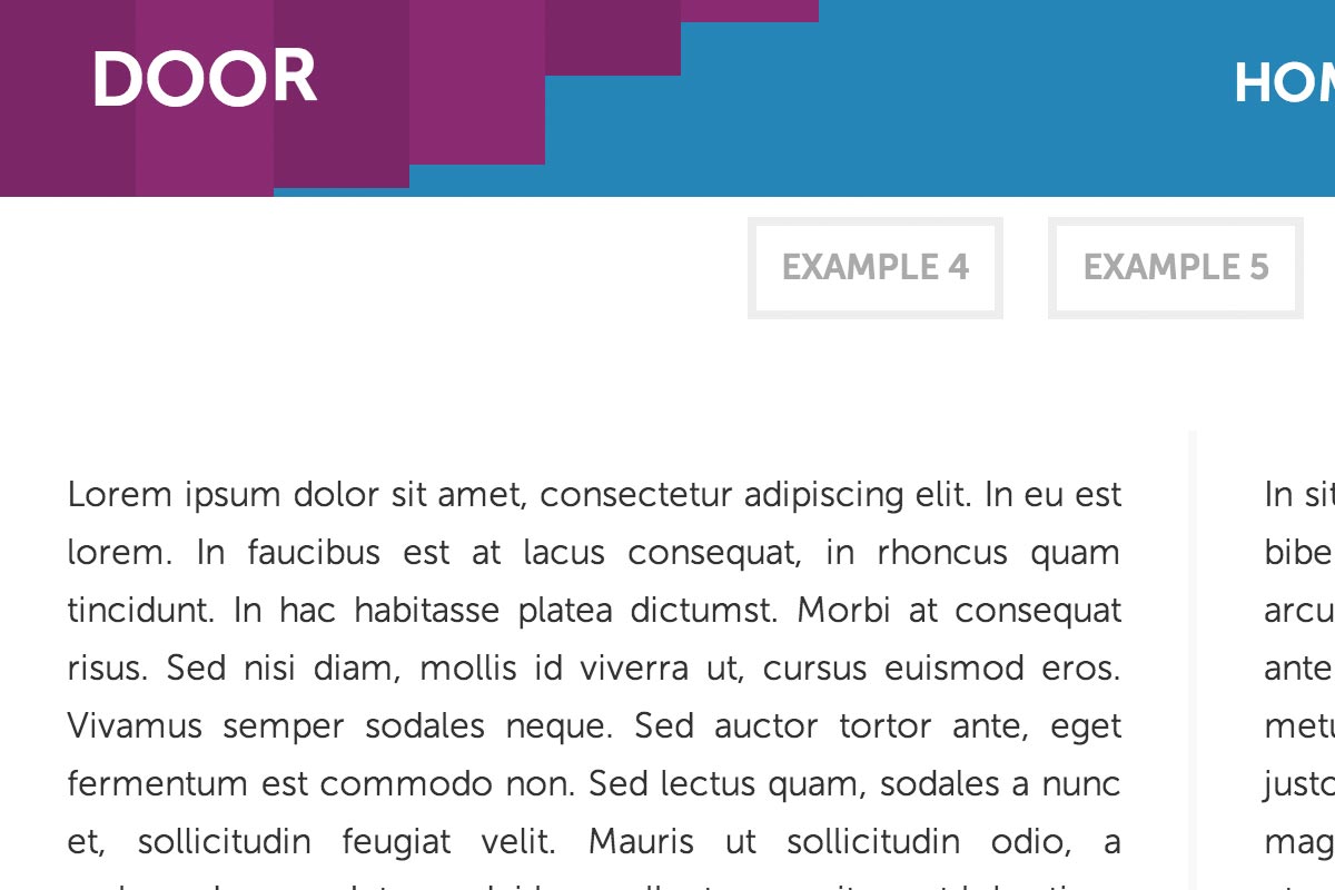
It’s become somewhat of a trend in web design to have a header that attaches to the top of the page as the user scrolls in order to provide the user with navigation or something along those lines. When the header attaches to the screen, we can use this point to create some pretty cool effects. In this tutorial we’re going to be looking at animations that activate as the user scrolls down.

Since a few of these are going to use 3D transforms, we’re going to use a cover div, to cover up the moving objects before they start moving, and to cover them up when they finish. This accomplishes a few things:
- 1. If we use clip it will cover up where we clipped so it appears as though it wasn’t clipped at all
- 2. 3D transforms are notorious for messing up hyperlink clicks, so using a cover div helps to fix that too
So to do that we have to put together a little jQuery script that will do all the work, and all it takes is just a little knowledge of how Javascript works. What we’re going to do is get the header position from the top of the page, and then get the users current scroll position, and if the scroll position is more than the header position, attach the header to the top of the page.
That way when you scroll past the header it attaches to the page, and since we’re adding a class to it we can do a little CSS animating too. To summarize the Javascript, if we have a cover slide we hide it. Then we run our animation and after it’s done, show the cover slide again. If the user is using a mobile nothing happens since these animations are a little shaky on mobile.
Our Javascript looks like this, although you can change it a little should you desire. For example, I added a function in example 5 and 6 to allow me to do the animation I wanted to do (see the download for more)
$(document).ready(function() {

	// Defining some variables
	var scroll, wresize, mobile;
	var headerPos = $('.header-content').offset().top; // The header position
	var once = true;
	var time = 600;
	var init = false;
	var show, go; // Timeout variables

	// A scroll function!
	(scroll = function() {

		// If the user isn't using a mobile
		if(mobile != true && $('.header-content').css('position') != 'fixed') {

			// Get the scroll position
			var scrollPos = $(document).scrollTop();

			// So if the scroll position is more than the header position..
			if(scrollPos > headerPos) {
				// First off clear the timeout for the removing class animation (see below)
				// So we don't get overlapping animations
				clearTimeout(show);

				// The scrolling has initiated so set init to true
				init = true;

				// This is so we only run the animation once, rather than after every scroll event
				if(once === true) {
					once = false;

					// Hide the cover
					$('.header .cover').hide();

					// And after 600ms, show it again. You can change this based on your animation length
					go = setTimeout(function() {
						$('.header .cover').show();
					}, time);
				}

				// Finally, add the attached class and change the top position so the header sticks to
				// the top of the oage
				$('.header-content').addClass('attached').css({'top' : (scrollPos-headerPos)+'px'});

			// Else the user is scrolling back up past the header.
			} else if(init === true) {

				// So clear the previous timeout
				clearTimeout(go);

				// And remove the class attached. Then change the top position to zero.
				$('.header-content').removeClass('attached').css({'top' : '0px'});

				// We reset once so that the animation can run again should the user scroll back
				// down past the header
				once = true;

				// We hide the cover again
				$('.header .cover').hide();

				// And then after 600ms show it.
				show = setTimeout(function() {
					$('.header .cover').show();
				}, time);

				// Then set init to false.
				init = false;
			}
		}

	})();

	// If the user touches the screen it is obviously a mobile device. This lets us disable any animations
	// for mobile users.
	window.addEventListener('touchstart', function() {
		mobile = true;
	});

	// Then finally run the scroll and psize functions on scroll and resize.
	$(document).scroll(scroll);
	$(window).resize(psize);

});
Based on how you want the animation to occur your HTML will look something like this:
<div class="header">
	<div class="header-content">
		<div class="cover">
			<div id="logo">
				DOOR
			</div>
			<div id="menu">
				<ul>
					<li><a href="">Home</a></li>
					<li><a href="">Articles</a></li>
					<li><a href="">Tutorials</a></li>
					<li><a href="">Forums</a></li>
				</ul>
			</div>
		</div>
		<div class="animation-stuff">
			<div id="logo">
				DOOR
			</div>
			<div id="menu">
				<ul>
					<li><a href="">Home</a></li>
					<li><a href="">Articles</a></li>
					<li><a href="">Tutorials</a></li>
					<li><a href="">Forums</a></li>
				</ul>
			</div>
		</div>
	</div>
</div>
The cover will appear and disappear in a set amount of time, and the animation can occur inside the .animation-stuff div. For animations, there are a few options. We’re attaching a class called ‘attached’ to the header-content div, so using that we can just use transitions to make things go from one state (before adding attached) to another (after) to create some cool effects.
The CSS doesn’t have to be difficult, we just have to change something in the attached state, and have a transition in the non attached state:
.header [class^='part'] {
	-webkit-transform: rotateX(90deg);
	-webkit-transition: -webkit-transform 0.1s linear
	transform: rotateX(90deg);
	transform-origin: 0 0;
}

.header .attached [class^='part'] {
	-webkit-transform: rotateX(0deg);
	transform: rotateX(0deg);
}
Another option is to use straight up animations and keyframes, although for most things transitions should suffice. That about does it for today. Check out the demo for some examples of the pretty cool stuff you can do using a mixture of CSS effects, or download the files to see how they were made.

