In part 1 of this guide we covered all the basics from implementation structure to more advanced things such use tags. In this part we’re going to expand upon what we already know, as well as look at some of the more interesting features that SVG has.

What we will cover
- Structure in depth
- More in depth styling
- Adding Text
- Gradients
- Filter Effects
Structure in-depth
In the previous part of this guide we looked at some pretty neat things we can do with our SVG structure. The structure of SVG is key to understanding exactly how it works, so before we move on lets take a look at some other structural elements that SVG allows us to use.
SVG inside SVG (Establishing new viewports)
Sometimes, when designing something in SVG, we want to establish a new viewport. A viewport is effectively the canvas on which we draw our SVG elements. Therfore, it makes sense that the standard way to do this is to use another SVG tag inside the first SVG tag with an altered position. For example, we could do something like this:
<svg width="500" height="400" version="1.1" xmlns="http://www.w3.org/2000/svg">
    <!-- Our SVG Code -->
    <!-- ...          -->

    <svg width="100" height="100" x="25" y="25" version="1.1" xmlns="http://www.w3.org/2000/svg">
        <!-- This is our newly established viewport -->
    </svg>
</svg>
The x and y attributes are where the new SVG element begins (in this example it is 25px across and 25px down). This new viewport can have its own viewBox (covered in part 1). The <svg> tag is not the only tag that defines a new viewport. The following tags do just that:
- SVG tag
- Symbol tag
- Image tag
We’ve covered SVG and symbols before, but what is an image tag?
The Image Tag
The image tag is exactly what you expect it to be. It’s a way to add images to your SVG documents. These can be anything such as png or jpeg, or even other SVG images. They work quite similarly to images in HTML documents:
<image x="400" y="400" width="200px" height="100px" xlink:href="penguins.png">
<image x="50" y="50" width="1200px" height="500px" xlink:href="penguins.svg">
Conditional Statements (or the switch tag)
The switch tag is pretty interesting because SVG is just a general XML based language, and conditional statements are more akin to Javascript or PHP, or even CSS more recently. Should the statement return true, the user will view the contents of the switch tag. Otherwise the contents will be hidden. The switch tag allows you to check for a few things and show SVG code accordingly:
<switch requiredFeatures="http://www.w3.org/TR/SVG11/feature#SVGDOM-animation">
   <!-- The browser supports animations. The code in here will only work if the browser supports animations. You could have some animation specific code here -->
</switch>

<switch systemLanguage="en, fr">
  <!-- The system language is english or french -->
</switch>
Adding Text
Adding text couldn’t be easier with SVG, you just use the text tag:
<text x="0" y="305" fill="orange" font-size="30">Hello World!</text>
You can even wrap text around a path, just create a path in the definitions area of your SVG document and wrap the text around that.
<defs>
   <path id="mypath" d="M 350,75 L 379,161 L 469,161 L 397,215 L 423,301 L 350,250 L 277,301 L 303,215 L 231,161 L 321,161 z" />
</defs>

<text x="0" y="305" fill="orange" font-size="30">
    <textPath xlink:href="#mypath">Hello World!</textPath>
</text>
Don’t forget to include the xlink:href xmlns link in your SVG tag (since we’re using xlink:href above)! As complicated as that sounds, it just means you need to change your SVG tag from something like this:
<svg width="500" height="400" version="1.1" xmlns="http://www.w3.org/2000/svg" xmlns:xlink="http://www.w3.org/1999/xlink">
to something like this:
<svg width="500" height="400" version="1.1" xmlns="http://www.w3.org/2000/svg">
Styling SVG
The main purpose of SVG is to create images, and without styles or the ability to style our SVG elements properly, SVG can seem almost pointless. For those reasons, before we move onto the more interesting things, lets take a look at styling in a little bit more detail.
Some of the more interesting things that SVG styling can do include:
- General Styles
- Gradients
- Filters
- Drop Shadows
- Text
General Styling
It’s possible to style SVG elements with a simple CSS-esque style tag, most CSS tags will work, as well as a few SVG specific ones that match up with attributes (for example fill: red and stroke: blue will work, in the same way as setting the property fill=”red” and stroke=”blue” does).
<rect x="100" y="100" width="300" height="300" style="background: red; border: 1px solid blue;"/>
Similarly, you can set style tags in your SVG and give your SVG tags classes, just like HTML!
 <style type="text/css"><![CDATA[
 .red {
     fill: red;
     stroke: blue;
     stroke-width: 3
}
]]></style>

<rect x="100" y="100" width="300" height="300" class="red" />
Gradients
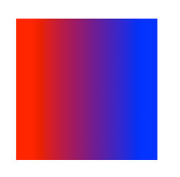
A pretty ugly gradient example
Gradients are a staple in modern web design, at least, for adding subtle depth to something. For that reason gradients are definable directly in SVG. Since they are definitions, we put them within def tags:
<defs>
    <!-- A pretty ugly gradient -->
    <linearGradient id="gradient">
        <stop offset="10%" stop-color="red" />
        <stop offset="90%" stop-color="blue" />
    </linearGradient>
</defs>
The stop tags represent the position the point at which the colour will begin to fade. You can add more colours or stop tags as you see fit. Since this gradient has been defined we can apply it to multiple elements just by using the url function:
<rect fill="url(#gradient)" stroke="blue" x="10" y="25" width="300" height="300"/>
Gradients can even be applied to borders! Just change the stroke="blue" above to stroke="url(#gradient)". If linear gradients aren’t really your thing, then perhaps a radial gradient would work instead:
<defs>
    <radialGradient id="gradient" gradientUnits="userSpaceOnUse" cx="400" cy="200" r="300" fx="400" fy="200">
        <stop offset="0%" stop-color="red" />
        <stop offset="50%" stop-color="blue" />
        <stop offset="100%" stop-color="red" />
    </radialGradient>
</defs>

<rect x="100" y="100" width="300" height="300" fill="url(#gradient)" />
There are a few attributes associated with the radial gradient which might make you look twice:
- gradientUnits – (can be userSpaceOnUse or objectBoundingBox) Determines how the stop tag offsets will work (i.e. what coordinating system they will use). So for example, if it’s set to userSpaceOnUse the units used will be mapped to the element you apply it to. If you set it to objectBoundingBox it will use its bounding box (i.e. the smallest area the gradient can fit into) as its coordinate system.
- cx, cy – The center of the radial gradient
- fx, fy – The focal point. Effectively the gradient is drawn in such a way so that the offset=”0%” at this point
Filters
Perhaps one of the most interesting ways to style your SVG elements is to use filters. Filters are similar to gradients, in that they are defined and can be reused, but the filter module is huge and provide many complicated ways to change how SVG elements are defined. Filters can become quite complicated and have a very specialized vocabulary of tags, but learning them is key to styling SVG. Most filters begin with a filter tag inside the usual <defs> tag.
<defs>
    <filter id="filter" primitiveUnits="userSpaceOnUse" x="0" y="0" width="200" height="120">

    </filter>
</defs>
That seems pretty simple, but it’s the stuff that goes into the filter that makes it important, and there are a lot of filter tags, each of which accomplish something different. Before we get to that though, there are a few things we should cover. Filters generally follow a set syntax, and some of the most common attributes are in and result.
The in attribute is what you’re trying to filter. When we finish our filter we will apply it to a block element such as an image or a <g> tag, and this is what we want the in attribute to represent. In total there are 4 aspects of an element we can filter (there are more but they aren’t widely supported).
- SourceGraphic – The graphic/image of the element we are applying our filters to. If there is no graphic/image then this will return as just black (nothing will happen basically)
- SourceAlpha – The alpha channels for the element we are applying our filters to. Again, if there are none this will return black.
- FillPaint – The contents of the fill tag. Often this is pretty useless to use, but it might be useful if the fill was a gradient or something.
- StrokePaint – The contents of the stroke tag. Again, usually quite useless.
- Contents of the result attribute – This is where the result attribute comes in. It’s effectively an identifier for the output. Think of filters like a machine. You put something into one component of the machine, and when it comes out you can place it in another component. So when your filtered element comes out of the first filter, you can identify it with the result attribute and then use it inside the
intag.
An example of the in/result mechanism
<!-- obviously the filter is not called 'thefilter',
     we'll cover filter types straight after this. -->

<!-- for the first filter we just use the SourceGraphic,
     that is the image or graphic of the element we're filtering.
     the result of this is called 'myfirstfilter -->

<thefilter in="SourceGraphic" result="myfirstfilter" />

<!-- we can then use 'myfirstfilter' as the base of our next filter
     i.e. we take our first filter and filter it again with another
     filter -->
<thefilter in="myfirstfilter" /></li>
Applying filters
Filters are applied to elements in SVG. You define a filter, and then it can be used on multiple elements. To apply a filter in SVG you simply use the filter tag:
<g filter="url(#filterid)">
   ...
</g>
#filterid being the id you applied to the filter (obviously!).
Filter list
The following titles are the tag names in question. There are a lot of filters and the art of filtering could take a while to truly master.
feBlend
Takes two images and blends them using common blending modes in image software. It has two ‘in’ inputs for this reason. This is quite useful to use in conjunction with feImage (see further below for more info on feImage).
There are 6 blend modes, those being normal, multiply, screen, darken and lighten. Here’s an example:
<filter id="blendmode">
   <feImage xlink:href="image.jpg" result="myimage" />
   <feBlend mode="screen" in="SourceGraphic" in2="myimage" />
</filter>
So in the above example we’re using the source graphic (the graphic of the element we’re going to apply the filter to) and the image we linked to using feImage, via the result tag. Of course, you can alter the filter blend tag to whatever blend mode you want.
feColorMatrix
feColorMatrix provides ways to modify or filter an object using a matrix. There are a few default settings too so if you’re not that familiar with matrices you can use those. Effectively this filter allows you to modify every pixel of an image.
Here are some basics on matrices. If you define a matrix like this:
1   1   1   0.5   1
0.5 0.2 1   0.5   0.1
1   1   1   1     1
0.1 0.4 0.7 0.5   1
and the incoming colour is RGBA(75,22,48,0.5) then the outgoing colour will be RGBA(R, G, B, A) where R, G, B, A are defined below:
R = 1*75 + 1*22 + 1*48 + 0.5*0.5 + 1
G = 0.5*75 + 0.2*22 + 1*48 + 0.5*0.3 + 0.1
B = 1*75 + 1*22 + 1*48 + 1*0.5 + 1
A = 0.1*75 + 0.4*22 + 0.7*48 + 1*0.5 + 1
The fifth column does not refer to a specific channel, rather it is a constant offset. Defining that matrix with feColorMatrix would look a bit like this:
<filter id="colormatrix">
    <feColorMatrix type="matrix" in="SourceGraphic" values="1   1   1   0.5   1
                                                            0.5 0.2 1   0.3   0.1
                                                            1   1   1   1     1
                                                            0.1 0.4 0.7 1     1"/>
</filter>
You don’t have to set a matrix though, and feColorMatrix provides different keywords which you can use instead of ‘matrix’ in the type attribute. For example, you can set type to saturate, hueRotate or luminanceToAlpha and not even define a matrix, but rather a single value. For saturate its a number, for hueRotate is a degree (since we’re rotating) and for luminanceToAlpha there is no value since its predefined.
feComponentTransfer
Effectively allows you to ‘remap’ a component (component meaning R, G, B or A channel). There are a few types and with each comes a specific way of altering the components.
- identity – default setting, no change
- table – allows you to provide a list of numbers and a few calculations which alter the component channel
- discrete – similar to table, in that we use a list of numbers. The calculation is quite complicated so I wont include it here
- linear – uses equation new component = slope*C + intercept to gain new component. Uses slope and intercept attributes
- gamma – uses equation new component = amplitude*C^exponent + offset to gain new component. Uses amplitude, exponent and offset attributes.
We use the tags feFuncR for the R channel, feFuncG for the G channel, and so on.
<filter id="Identity">
    <feComponentTransfer>
        <feFuncR type="identity"/>
        <feFuncG type="identity"/>
    </feComponentTransfer>
</filter>
<filter id="Table">
    <feComponentTransfer>
        <feFuncR type="table" tableValues="1 1 0 1"/>
        <feFuncG type="table" tableValues="1 0 0 1"/>
        <feFuncB type="table" tableValues="0 0 1 0"/>
    </feComponentTransfer>
</filter>
<filter id="Linear">
    <feComponentTransfer>
        <feFuncR type="linear" slope=".2" intercept=".1"/>
        <feFuncG type="linear" slope=".45" intercept="0"/>
        <feFuncB type="linear" slope=".9" intercept=".23"/>
    </feComponentTransfer>
</filter>
<filter id="Gamma">
    <feComponentTransfer>
        <feFuncR type="gamma" amplitude="3" exponent="5" offset="0"/>
        <feFuncG type="gamma" amplitude="4" exponent="4" offset="2"/>
        <feFuncB type="gamma" amplitude="5" exponent="3" offset="0"/>
    </feComponentTransfer>
</filter>
feComposite
Creates a composite of two images using the porter duff compositing operations. Since we’re compositing we use two inputs. There are a few attributes that you might want to know:
- operator – can be set to over, in, out, atop, xor or arithmetic.
- k1, k2, k3 and k4 – if set to arithmetic, you can use these attributes to determine numbers that change the effect. The calculation is done like so: result = k1*i1*i2 + k2*i1 + k3*i2 + k4, where i1 and i2 are the pixel data from input 1 and 2 respectively
<filter id="composite">
    <feImage xlink:href="image.jpg" result="myimage" />
    <feComposite in="SourceGraphic" in2="myimage" operator="arithmetic" k1=".5" k2=".5" k3=".5" k4=".5" />
</filter>
feConvolveMatrix
A convolution combines pixels with neighbouring pixels to produce an output. feConvolveMatrix combines this effect with a matrix to set how the neighbouring pixels combine. There are a few attributes:
- order – the number of cells in the matrix. i.e. if it’s set to 3 each row will be 3 numbers long. If two numbers are set then the first will represent x and the second, y.
- targetX – Determines the positioning in X of the convolution matrix relative to a given target pixel in the input image. The leftmost column of the matrix is column number zero.
- targetY – Determines the positioning in Y of the convolution matrix relative to a given target pixel in the input image. The topmost row of the matrix is row number zero.
- edgeMode – can be duplicate, wrap or none. Determines how the pixel colours should be handled at the edge of images. For example, if set to duplicate the pixels at the edge of the image will be duplicated for as long as necessary. If set to wrap, then it’ll take the colours from the other side of the image.
- kernelMatrix – The numbers that make up the matrix
- kernelUnitLength – Indicates the distance between rows and columns. If two numbers are set then the first represents the columns and the second the rows. This is based off the units for the filter, i.e. the ‘primitiveUnits’, a setting which can be set to userSpaceOnUse or objectBoundingBox, which we covered before in gradients.
- divisor – after applying the matrix to an image the output is divided by the divisor number if set.
- bias – after applying the matrix and dividing it by the divisor, the bias is added to the number.
- preserveAlpha – if transparency should be preserved or not.
<filter id="convolvematrix">
    <feConvolveMatrix in="SourceGraphic" order="3 3" edgeMode="duplicate" targetX="0" targetY="0" kernelMatrix="1 5 3 2 1 5 7 2 1" preserveAlpha="false" />
</filter>
feDisplacementMap
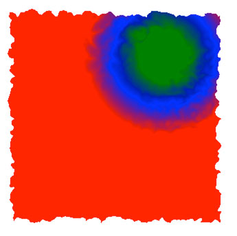
A radial gradient applied to a displacement map (code below)
This filter uses the positions of one input to change the positions of another input, i.e. it alters one image using data from another image. For this reason it uses two inputs, a scale and you can set specifically which channel you want to filter (R, G, B or A), and specifically along which axis you want to select that channel.
  <defs>
	<filter id="displace">
	    <feTurbulence  baseFrequency=".04" numOctaves="2" result="myturbulence" />
	    <feDisplacementMap in="SourceGraphic" in2="myturbulence" scale="20" />
	</filter>
	<radialGradient id="gradient" cx="250" cy="90" r="150" gradientUnits="userSpaceOnUse">
		<stop offset="25%" stop-color="green"/>
		<stop offset="50%" stop-color="blue"/>
		<stop offset="75%" stop-color="red"/>
	</radialGradient>
  </defs>

  <rect fill="url(#gradient)" x="30" y="30" width="300" height="300" filter="url(#displace)" />
The above uses a turbulence filter (see feTurbulence for more info) as a source for a displacement map and then displaces the element based off data for that map. We applied a gradient to the rectangle which is then mapped to the displacement map.
feFlood
Effectively creates a rectangular area which is filled with a colour of your choosing. This can be used to create a solid colour and then used in other filters. The flood-colour is the colour, and the flood-opacity is the opacity (in case you didn’t get it!)
<filter id="flood">
    <feFlood flood-color="green" flood-opacity="0.5"/>
</filter>

<h3>feGaussianBlur</h3>
Just a simple blur. Not that difficult to accomplish. The <code>stdDeviation</code> property is the amount of blur you wish to add. If you give two numbers the first will apply along the x axis and the second along the y axis. Sometimes this filter is used to create a sort of 'drop down shadow' effect.

<filter id="blur">
    <feGassianBlur in="SourceGraphic" stdDeviation="4" />
</filter>
feImage
An image that you wish to use as part of the filtering process. Especially useful when wanting to blend two images with SVG using feBlend, although it can be used in a bunch of circumstances. The syntax is pretty simple, and the image is usually linked to another image via the result attribute.
<filter id="image">
   <feImage xlink:href="image.jpg" result="myimage" />
</filter>
feMerge
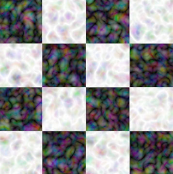
A checkerboard image merged with a turbulence filter
Allows you to take multiple outputs and merge them. To do that we take our outputs via the result attirbute and merge them like this:
<filter id="merge">
    <feTurbulence  baseFrequency=".04" numOctaves="2" result="myturbulence" />
    <feImage xlink:href="myimage.jpg" width="50" height="50" result="myimage" />
    <!-- Merge them -->
    <feMerge>
        <feMergeNode in="myimage"/>
        <feMergeNode in="myturbulence"/>
    </feMerge>
</filter>
feMorphology

Thickens or thins shapes and artwork. It has an attribute called operator which can be set to erode (to make thinner) or dilate (to make fatter). Then we set a radius which is the amount we wish to erode or thicken the element by:
<filter id="thicker">
    <feMorphology operator="dilate" radius="10" />
</filter>
feOffset
Offsets the element we are applying the filter to. Effectively moves it a certain distance in the x and y directions.
<filter id="move">
    <feOffset in="sourceGraphic" dx="20" dy="40" />
</filter>
feTile
feTile provides a way to take input of an image and tile it across an object. The syntax can be quite simple, all you have to do is define an image using feImage and then call the feTile tag:
<filter id="pattern">
    <feImage width="100" height="100" result="image1" xlink:href="image.jpg"/>
    <feTile />
</filter>
feTurbulence
The feTurbulence filter creates a weird map of turbulence using a few attributes. This distorted map can then be used and applied to other filters to reach a desired effect. Here’s a list of all the attributes for feTurbulence:
- baseFrequency – effectively the amount of noise. It is a number. If two numbers are defined they represent the nose along the x and y axis respectively.
- numOctaves – Affects how the noise looks
- seed – The starting number for the random number generator
- stitchTiles – can be set to
stitchornoStitch. If set to no stitch no effort will be made to link tiles together, whereas if it’s set to stitch the filter will make it contain an even number of ‘noise’ elements to improve linkage. - type – can be
fractalNoiseorturbulence. The fractalNoise filter makes the filter just produce noise, whereas turbulence creates a cool turbulence effect.
<filter id="turbulence">
    <feTurbulence  baseFrequency=".04" numOctaves="2" result="myturbulence" />
</filter>
Lighting Effects
It is possible to even add lighting effects with SVG’s magnificent filter system. There are two types of lighting, feDiffuseLightingfeSpecularLighting. Specular lighting uses this model. Diffuse lighting can also be seen on that page in the image under description. There are also 3 main tags which determine lighting that go inside these two tags:
feDistantLight– has the attributes azimuth, which is the angle between the x and y axis, and elevation, which is how far up the light source is positionedfePointLight– Sets a light source at a specific coordinate using x, y, and z attributesfeSpotLight– Sets a spot light using x, y and z coordinates. Then it sets where the spot light is pointing at with pointsAtX, pointsAtY and pointsAtZ. Then sets a limiting factor in degrees to where the light cannot point using limitingConeAngle
Example of 3 light sources
<!-- A distant light -->
<feDistantLight azimuth="40" elevation="20"/>

<!-- A point light -->
<fePointLight x="200" y="30" z="10" />

<!-- A spot light -->
<feSpotLight x="70" y="100" z="20" limitingConeAngle="40" pointsAtX="250" pointsAtY="40" pointsAtZ="0"/>
Basically you pick a light source and place it in a light type, either diffuse or specular. Again, these have numerous settings. For both diffuse lighting and specular you can set a lighting colour, i.e. the colour of the light you wish to use.
<filter id="diffuse">
    <feDiffuseLighting in="SourceGraphic" result="diffuselighting" lighting-color="white">
        <fePointLight x="200" y="30" z="10" />
    </feDiffuseLighting>
</filter>

<filter id="specular">
    <feDiffuseLighting in="SourceGraphic" result="specularlighting" lighting-color="white">
        <fePointLight x="200" y="30" z="10" />
    </feSpecularLighting>
</filter>
Filters to Create Drop Shadows
There is no ‘drop shadow’ tag in SVG, so we sort of have to improvise. Basically, we take the element we want to give a drop shadow and add a filter which takes the element, offsets it, blurs it and removes colour, and then we use a colour matrix to lower the opacity. Sound pretty complicated? Well for a drop shadow, it is pretty complicated. But it’s doable. Here is the code, which should give this green square a drop shadow.
<defs>
	<filter width="200%" height="200%" id="dropshadow">
	    <feOffset result="offset" in="SourceAlpha" dx="20" dy="20" />
	    <feGaussianBlur result="gaus" in="offset" stdDeviation="10" />
	    <feColorMatrix in="gaus" result="color" type="matrix"
	          values="0 0 0 0   0
	                  0 0 0 0   0
	                  0 0 0 0   0
	                  0 0 0 .3  0 "/>
	    <feBlend in="SourceGraphic" in2="color" mode="normal" />
	</filter>
</defs>

<rect fill="green" x="30" y="30" width="200" height="200" filter="url(#dropshadow)" />
Summary
We’ve covered quite a bit in this part. Next time we’ll cover things like animations, interactions and transforms, as well as a few other cool features, so stay tuned! The best way to learn is to experiment, so open up a new SVG document and try out some of the things shown here. Don’t forget to read part 1 if you missed it, and have a good day!
