It seems like CSS has hit the top of its game. Web designers can do just about anything with CSS nowadays. Well, almost anything. Today, I’m going to talk about something truly awesome (and new), and that is CSS Custom Filters. These allow us to morph and warp regular HTML elements into shapes that were impossible before.
Custom Filters?
I saw a post a while ago about creating CSS Balls. That was cool, but it made me think how limited we were as designers because we couldn’t actually create things like this. We had to create an illusion that this was a sphere, it wasn’t an actual sphere. After searching for a solution, I found CSS Custom Filters.
Now I’ve talked a little about filters before, but custom filters are a relatively new addition to CSS. They’re still extremely experimental, to the point of only being available in Chrome, but disabled by default. Custom Filters allow you to literally warp an HTML element into any shape you can imagine.
Testing it out
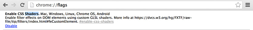
First off, it’s not enabled by default. Custom filters are very experimental. To enable it go to chrome://flags. You should see ‘CSS Shaders’ (image below). Enable it and restart chrome. Now we’re good to go!
How does it work?
Well there are a few things that have to happen for this to work. We are going to be using shaders to make these filters work. A shader is just something that is used to make postprocessing effects and will allow us to warp and change our div or span or whatever.
At least one external files is required, but an optional second file is often used to give some sort of shading or shadowing to the effects. The required file is called the vertex shaders file and has the extension .vs. The second, optional fragment shaders file (which adds shadows, etc) has the extension .fs. Both files are coded using the OpenGL language.
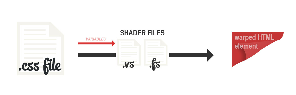
So what happens is we include our two external files via a CSS filter line, and then we can pass variables to these files via this CSS line. So for example, we can make it so we have blurLine set to 0.5, and then this will be read by our shader files. We can then manipulate this data into creating shapes and distorting our HTML element.
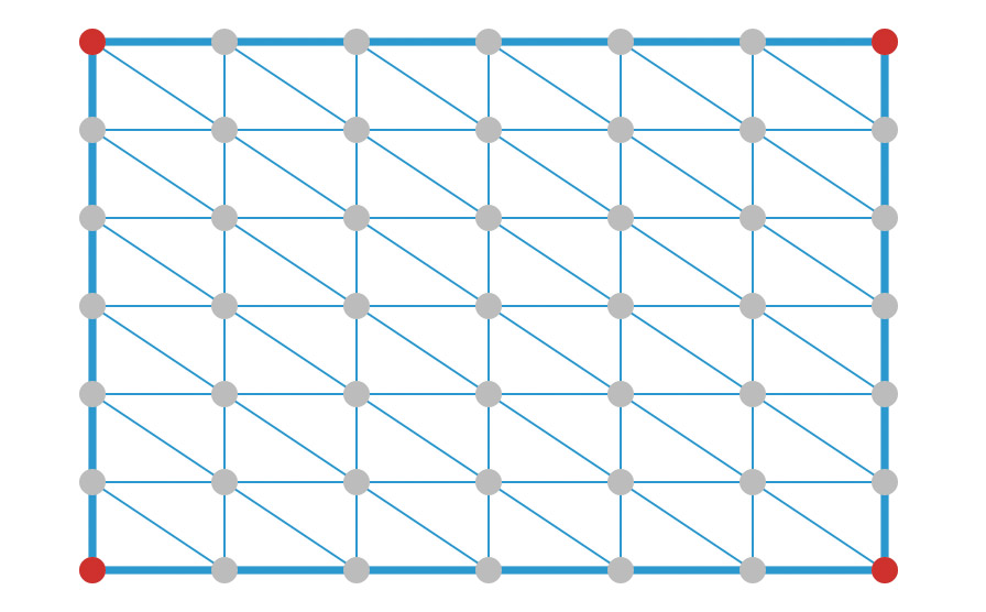
The HTML element is warped based on vertices, which basically break the HTML element into parts allowing us to alter their position in 3D space. For example, the below would be a 6 by 6 vertex grid.
The Syntax
The syntax is obviously not set in stone because this is a very experimental part of the specification. Suffice to say, we include our files using the functional notation custom(). We then define how many vertices our element will have and then pass some variables to our files. Generally when we include our fragment shaders file (that’s the one that adds shadows and stuff like that) we use the functional notation mix(). All mix does is mixes on top of our warped element a colour matrix using a blending mode like multiple, overlay, etc.
So an example of how our syntax might look is this:
    -webkit-filter: custom(
    url(shaders.vs) /* Our vector shader */
    mix(url(shaders.fs) normal source-atop), /* Fragment Shader */
    50 50, /* The numbers are the number of vertices (x and y) */
    variable 5, anotherVar 6.2) /* Variables */;
The 50 50 is key, that’s the number of vertice points you want your HTML element to have. The mix() bit is optional, but might be desirable if you want to add some shadows to your effect.
Examples
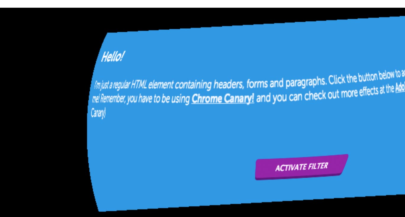
So lets get onto some examples. I’ve added some videos below because they’re disabled by default, but I’ll provide the links for anyone wanting to try them out. To create these effects I’m using some shaders from the Adobe Filter Labs, although you can make your own if you’re competent enough in OpenGL.
Page Curl
Page Fold
Spherify
Summary
This addition to the CSS filter specification is a total game changer. This lets us do just about anything we want on the web with content which would’ve previously been impossible. Things that were outside the realms of CSS and HTML have now been easily brought into their scope, while giving developers new ways to make the user experience more exciting.


