
If responsive design was the first step in making the web accessible for mobile devices then gesture design is the next. Touch screens and gestures render a device more accessible, providing real mechanical input to improve the user experience. This is also true for web design on mobile devices.
Gesture Design
A gesture is a movement your finger makes on a touch device which activates an animation or action to occur. For instance, swiping to the left may go to the next article. There are many ways to approach gesture design. Gestures provide real life input into something and the user innately knows what they should do.
In fact sometimes a user may do a gesture expecting something to happen only to realise “Oh, it’s the internet. You can’t do gestures on the internet”. Well it’s about time we changed that, and the easiest way to do that is with a little Javascript library called Hammer.js.
Hammer.js
Hammer doesn’t need jQuery but a lot of people will probably use it alongside jQuery. It’s really simple to use, too. It works mostly the same as adding event listeners:
var element = document.getElementById('test_el');

Hammer(element).on("tap", function(event) {
    // Some function goes here
});
Now all it takes is a little Javascript know-how to create some cool effects. Hammer accepts a range of gestures, including
- hold
- tap
- doubletap
- drag, dragstart, dragend, dragup, dragdown, dragleft, dragright
- swipe, swipeup, swipedown, swipeleft, swiperight
- transform, transformstart, transformend
- rotate
- pinch, pinchin, pinchout
I’ve put together a quick little demo (URL is http://jsfiddle.net/xAHe8/) which you can try out on your mobile. It’s not fully functional but try pinching and swiping. All I’ve done here is created a cube with CSS transforms and then added some CSS styles when the user tries to pinch, like so:
Hammer(document).on("pinchin", function(event) {
	$('#element').css({'transform' : 'scale3d(0.5, 0.5, 0.5)'});
});
Pretty simple, right? All this took was 3 lines of code and we already have a gesture that resizes things on pinch.
For Usability
Did you know that as of July 2013 20% of pageviews are coming from mobile devices? That’s a pretty big number, and it’s set to increase further, yet mobile usability is usually a second thought. That is going to have to change in a world where mobile devices are the norm.
So gestures are probably going to be a big part of adapting our websites for mobile devices. Not only do they allow for some neat effects but they let us improve the usability and user experience of using our sites. One way that gestures can make web usage on mobiles less of a pain and more of an experience is by using off canvas design.
Off Canvas Design
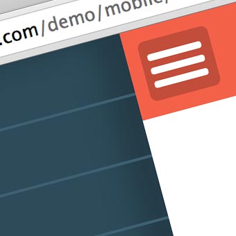
This is something that has been talked about for a little while but it’s something gestures can really take advantage of. Look at the Facebook App on iPhone and Android. All you see is what’s on the phone, but from a designer’s perspective it might actually looks a little like this:
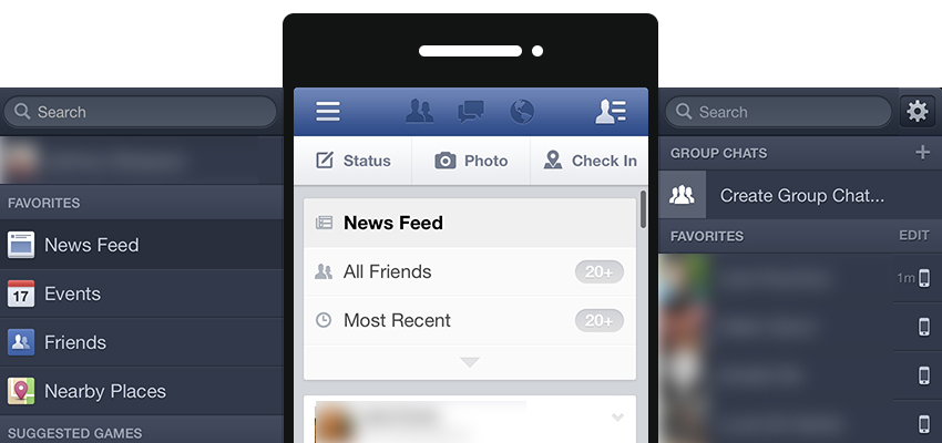
But why would you want to do this? Well for one, it reduces clutter on the screen. For a long time now it has been standard to remove sidebars on mobile devices and go for a single column. That reduces a lot of the space users have to work in.
Single column websites are nice, but they almost make the user feel like they’re in a temporary space, something sort of unfinished. Using a slide out sidebar like facebook does is one way to increase the perceived amount a user can do on a site. Using gestures makes this a lot more intuitive.
The second reason I’ve already hinted at. Gestures are just user friendly. Using a gesture in this instance is a natural user response. They expect the gesture to work. Plus at the moment gestures are rare enough that it adds a bit of uniqueness to your design.
There are a variety of ways you can put ‘dragging’ gestures into action. The one above instigates a left or right slide, but you could just as usually use an up or down pull action.
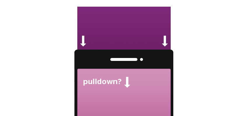
This could be written as simply as:
var element = document.getElementById('element');

Hammer(element).on("swipedown", function(event) {
    $('#element').addClass('pulldown');
});
Where pulldown is a class that starts a CSS animation moving the div downwards. I’ve set up a quick little demo of how to use hammer to create an off canvas design like the facebook app which you can see here (URL is http://bit.ly/15hFlwi). You can download it here.
Mobile First Design
Before we continue I thought I’d write this little blurb on mobile first design. This is a sort of web design movement where the concentration is put on mobile devices before desktops. Is this a good idea? Yes and no. The majority of the internet still lies with desktop or desktop-esque devices. Putting too much energy into mobile can leave you with little left for a desktop site which is what most people are going to see.
On the other hand, designing for mobile first gives you the great advantage of not disillusioning your mobile viewers. Mobile viewers are a growing demographic and one that cannot be ignored. Gesture design is a simple way to engage them, but responsive design and design for mobile rather than adapted desktop design for mobile are other ways. Remember who you’re designing for, what would be good for them, and how they use their devices.
Gesture Inspiration
To finish up, lets look at a few mobile applications that are using gestures to their fullest extent as a little bit of inspiration. That way you can get a bit of an idea on how to implement gestures in your design.
Mailbox
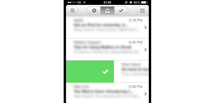
Mailbox uses gestures in a way that is quite ingenious, and the whole interface really revolves around gestures. For mobile devices I think this works perfectly, since there is very little room to add much else. A right swipe will mark mail as read, or a long left swipe will delete it. A right swipe can delete or archive an email. Such simple and effective gesture usage is what you should be aiming for on a website.
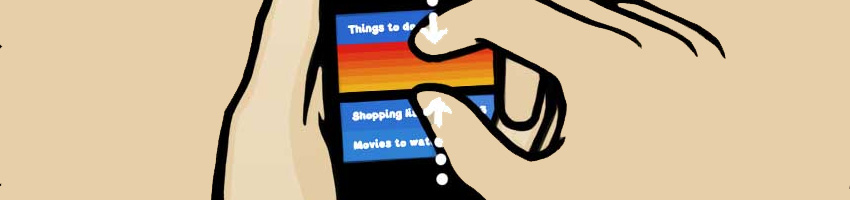
Clear
When it comes to good use of gestures none are as praised as clear, a simple to do list manager that uses gestures like they’re going out of style. Clear uses pulls, swipes and pinches to make to do list creation a total breeze. Gestures help to greatly improve the user experience here. It makes the application almost a game to play with. You can see a quick video of it in action here.
Remember keep it simple, and don’t overdo it. Adding a few gestures can be intuitive, adding too many might come off as unnecessary.
Final Words
Gesture design is becoming increasingly prevalent across mobile applications but unfortunately the same cannot be said for websites. Many websites design themselves as applications and then miss out on great opportunities to use gestures. Using a few gestures is going to improve usability, help increase mobile pageviews and who knows what else. Gesture design should be as high on your priority list as responsive design. So next time you’re working on a project, consider gestures as a way to conquer some of your design problems. It will probably improve your UX too!

