Spin.. spin..
This is a little something I made in my spare time, just for a bit of fun. It was excruciatingly time consuming as I felt the easiest way to do it was to make individual bars and rotate them into the right position. The pain of changing left by 2% was almost excruciating. I used percentages in particular as I felt I wanted it to be resizeable in an easy way (It would have to be, changing the size manually is perhaps the most soul destroying endeavour you might ever lead yourself onto do). Anyway, onward with the understanding.
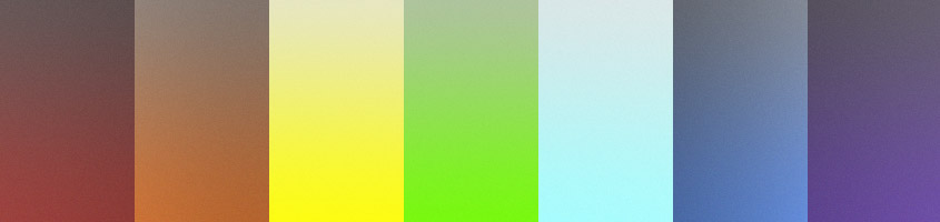
It’ll work in..
| Webkit | Mozilla | Trident | Presto |
| Yes | Yes | Yes | No Animaton |
How it was made
Basically, I got a bunch of divs, put them in another div, set each div inside the main div a particular size as a percentage of the main div, and animated them to change opacity. Pretty easy huh? Well it would have been if changing the position of something was easier, and if when we just did a property like ‘animation’ the browser would change to its specific iteration instead of having to use three properties consisting of -moz, -webkit and -ms.
Perhaps one of the most devastating moments of my life was when I realised this wasn’t going to work in Opera. So I tried my damnest, but because of no animation support, it’ll just look like some fancy wheel rather than a loading sign. Anyway, here’s what the HTML is going to look like:
<div class="spinner">
	<div class="piece a"> </div>
	<div class="piece b"> </div>
	<div class="piece c"> </div>
	<div class="piece d"> </div>
	<div class="piece e"> </div>
	<div class="piece f"> </div>
	<div class="piece g"> </div>
	<div class="piece h"> </div>
	<div class="piece i"> </div>
	<div class="piece j"> </div>
	<div class="piece k"> </div>
	<div class="piece l"> </div>
	<div class="piece m"> </div>
	<div class="piece n"> </div>
	<div class="piece o"> </div>
	<div class="piece p"> </div>
</div>
The CSS looks like this:
<style type="text/css">
.spinner {
	width: 32px;
	height: 32px;
}

.piece {
	background: #000;
	width: 50%;
	height: 14%;
	position: relative;
}

.spinner div {
	opacity: 0.2;
}

@-webkit-keyframes fade {

	5% { opacity: 0.8; }
	30% { opacity: 0.5; }

}
@-ms-keyframes fade {

	5% { opacity: 0.8; }
	30% { opacity: 0.5; }

}
@-moz-keyframes fade {

	5% { opacity: 0.8; }
	30% { opacity: 0.5; }

}

.a, .p {
	height: 50%;
	width: 14%;
	left: 99%;
}

.a {
	top: 5%;
	-webkit-animation: fade 3.2s ease-in infinite;
	-moz-animation: fade 3.2s ease-in infinite;
	-ms-animation: fade 3.2s ease-in infinite;
}

.b {
	bottom: 21%;
	left: 50%;
	-webkit-animation: fade 3.2s ease-in-out 3s infinite;
	-moz-animation: fade 3.2s ease-in-out 3s infinite;
	-ms-animation: fade 3.2s ease-in-out 3s infinite;
}

.c {
	bottom: 34%;
	left: 110%;
	-webkit-animation: fade 3.2s ease-in-out 0.2s infinite;
	-moz-animation: fade 3.2s ease-in-out 0.2s infinite;
	-ms-animation: fade 3.2s ease-in-out 0.2s infinite;
}

.d {
	bottom: 31%;
	left: 27%;
	-webkit-animation: fade 3.2s ease-in-out 2.8s infinite;
	-moz-animation: fade 3.2s ease-in-out 2.8s infinite;
	-ms-animation: fade 3.2s ease-in-out 2.8s infinite;
}

.e {
	bottom: 43%;
	left: 134%;
	-webkit-animation: fade 3.2s ease-in-out 0.4s infinite;
	-moz-animation: fade 3.2s ease-in-out 0.4s infinite;
	-ms-animation: fade 3.2s ease-in-out 0.4s infinite;
}

.f {
	bottom: 32%;
	left: 11%;
	-webkit-animation: fade 3.2s ease-in-out 2.6s infinite;
	-moz-animation: fade 3.2s ease-in-out 2.6s infinite;
	-ms-animation: fade 3.2s ease-in-out 2.6s infinite;
}

.g {
	bottom: 45%;
	left: 149%;
	-webkit-animation: fade 3.2s ease-in-out 0.6s infinite;
	-moz-animation: fade 3.2s ease-in-out 0.6s infinite;
	-ms-animation: fade 3.2s ease-in-out 0.6s infinite;
}

.h {
	bottom: 30%;
	left: 6%;
	-webkit-animation: fade 3.2s ease-in-out 2.4s infinite;
	-moz-animation: fade 3.2s ease-in-out 2.4s infinite;
	-ms-animation: fade 3.2s ease-in-out 2.4s infinite;
}

.i {
	bottom: 43%;
	left: 155%;
	-webkit-animation: fade 3.2s ease-in-out 0.8s infinite;
	-moz-animation: fade 3.2s ease-in-out 0.8s infinite;
	-ms-animation: fade 3.2s ease-in-out 0.8s infinite;
}
.j {
	bottom: 29%;
	left: 12%;
	-webkit-animation: fade 3.2s ease-in-out 2.2s infinite;
	-moz-animation: fade 3.2s ease-in-out 2.2s infinite;
	-ms-animation: fade 3.2s ease-in-out 2.2s infinite;
}

.k {
	left: 149%;
	bottom: 41%;
	-webkit-animation: fade 3.2s ease-in-out 1s infinite;
	-moz-animation: fade 3.2s ease-in-out 1s infinite;
	-ms-animation: fade 3.2s ease-in-out 1s infinite;
}


.l {
	bottom: 30%;
	left: 28%;
	-webkit-animation: fade 3.2s ease-in-out 2s infinite;
	-moz-animation: fade 3.2s ease-in-out 2s infinite;
	-ms-animation: fade 3.2s ease-in-out 2s infinite;
}

.m {
	bottom: 43%;
	left: 134%;
	-webkit-animation: fade 3.2s ease-in-out 1.2s infinite;
	-moz-animation: fade 3.2s ease-in-out 1.2s infinite;
	-ms-animation: fade 3.2s ease-in-out 1.2s infinite;
}

.n {
	bottom: 40%;
	left: 50%;
	-webkit-animation: fade 3.2s ease-in-out 1.8s infinite;
	-moz-animation: fade 3.2s ease-in-out 1.8s infinite;
	-ms-animation: fade 3.2s ease-in-out 1.8s infinite;
}

.o {
	left: 110%;
	bottom: 52%;
	-webkit-animation: fade 3.2s ease-in-out 1.4s infinite;
	-moz-animation: fade 3.2s ease-in-out 1.4s infinite;
	-ms-animation: fade 3.2s ease-in-out 1.4s infinite;
}
.p {
	bottom: 78%;
	-webkit-animation: fade 3.2s ease-in-out 1.6s infinite;
	-moz-animation: fade 3.2s ease-in-out 1.6s infinite;
	-ms-animation: fade 3.2s ease-in-out 1.6s infinite;
}

.b, .o {
	-webkit-transform: rotate(67.5deg);
	-moz-transform: rotate(67.5deg);
	-ms-transform: rotate(67.5deg);
	-o-transform: rotate(67.5deg);
}

.d, .m {
	-webkit-transform: rotate(45deg);
	-moz-transform: rotate(45deg);
	-ms-transform: rotate(45deg);
	-o-transform: rotate(45deg);
}

.f, .k {
	-webkit-transform: rotate(22.5deg);
	-moz-transform: rotate(22.5deg);
	-ms-transform: rotate(22.5deg);
	-o-transform: rotate(22.5deg);

}

.n, .c {
	-webkit-transform: rotate(-67.5deg);
	-moz-transform: rotate(-67.5deg);
	-ms-transform: rotate(-67.5deg);
	-o-transform: rotate(-67.5deg);}

.l, .e {
	-webkit-transform: rotate(-45deg);
	-moz-transform: rotate(-45deg);
	-ms-transform: rotate(-45deg);
	-o-transform: rotate(-45deg);
}

.j, .g {
	-webkit-transform: rotate(-22.5deg);
	-moz-transform: rotate(-22.5deg);
	-ms-transform: rotate(-22.5deg);
	-o-transform: rotate(-22.5deg);
}

</style>
Now I could spend forever explaining this, but basically I just moved a bunch of divs around, and used some transforms to make them look like a wheel. Then I used a simple animation to make them fade in at the right time, and applied the animation with a certain timing so it all worked out. You can learn more about animations here, in our lovely tutorial. If you’re stuck that is.
Since I’ve used percentages (a tactical move, if I do say so), you can change the width and height of the spinner class and that’ll change the width and height of the spinner. Remember though, that won’t mean the spinner will be that height and width. It’ll be slightly larger. As a side note, compressed, the CSS file amounts to about 4kb, which is smaller than a lot of gifs out there. I realise perhaps its not a good alternative at the moment because it lacks 100% support, but we can hope one day it will be, right?
Check out the demo below to see what it looks like. I’ve also provided a condensed version in the download link, seeing as the CSS is a little elaborate.

