CSS Tags
Tags are used generally at the bottom of web content to categorize content. It’s a pretty neat idea, but usually creating something that looks like a real tag can be a little cumbersome. I set out today to make an easy to use tag, with minimal syntax using just CSS and HTML (no images).
Starting out
So when I started out I created a basic tag. It was pretty nice, but it lacked the customization that I wanted from the tag. You see, to create the triangle you need to use the border property, something which gradients do not work with. So my plan was to use box-shadow to create a sort of pseudo-gradient, at least giving me or whoever was using it the opportunity to add the illusion of depth, or customize the tag more closely.
Lets take a look at the first version of the tag. The HTML was simple, just a link:
<a href="#" class="tag">
	InsertHTML
</a>
I used the before and after CSS pseudo properties to apply an arrow and a little circle to the tag:
.tag {
	font-family: Helvetica, Arial, sans-serif;
	background: #588fe5;
	display: inline-block;
	color: #fff;
	position: relative;
	padding: 10px;
	border-top-left-radius: 4px;
	border-bottom-left-radius: 4px;
	margin: 0 30px 0 0;
	text-decoration: none;
}

.tag:hover {
	background-color: #739fe4;
}

.tag:before {
	background: #fff;
	width: 10px;
	height: 10px;
	content: "";
	display: inline-block;
	border-radius: 20px;
	margin: 0 5px 0 0;
}

.tag:after {
	display: inline-block;
	border: 19px solid;
	border-color: transparent transparent transparent #588fe5;
	height: 0;
	width: 0;
	position: absolute;
	right: -38px;
	top: 0;
	content: "";
	display: inline-block;
}


.tag:hover:after {
	border-color: transparent transparent transparent #739fe4;
}
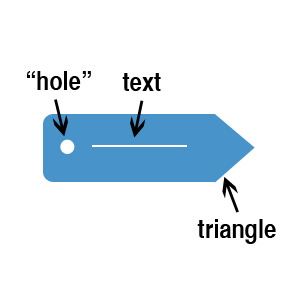
Now I faced a problem. This totally left me unable to use box-shadow like I wanted to. Why? Because I placed the arrow absolute and slightly outside the box. This means any box shadow applied would only surround the text and ball, and not the arrow as I would’ve wished. Applying a box shadow to the border and somehow shading them together is impossible. This is what the tag looked like:
It’s nice, but not what I was looking for. So I needed to try something else!
Attempt 2
So on my second attempt I used a different technique. I added some padding just beside the text, and instead of creating an arrow, I created the inverse of an arrow, so I could create the illusion that the arrow was there. I then placed this just beside the tag and gave it pointer-events: none; so that we couldnt click outside the tag to click the tag, something we couldn’t do before with the first attempt.
The only problems with this version is that I had to add a span to the anchor, and the box I’m placing over the tag to make it seem like an arrow is there has to be manually assigned whatever the background color is. On top of that, the box blocks out the shadow, so it appears cut off. I actually liked this, and added an animation so that it appeared the tag was sort of sliding out of a sleeve. You can remove this if you want by removing the transition lines. The CSS is slightly more complex, but hopefully you’ll understand:
.tag {
	font-family: Helvetica, Arial, sans-serif;
	display: inline-block;
	color: #fff;
	position: relative;
	padding: 10px 35px 10px 10px;
	border-top-left-radius: 4px;
	border-bottom-left-radius: 4px;
	margin: 0 40px 20px 0;
	text-decoration: none;
	-webkit-transition: right 0.2s ease-in;
	-moz-transition: right 0.2s ease-in;
	-ms-transition: right 0.2s ease-in;
	background: #d63838;
}

.tag:before {
	background: #fff;
	width: 10px;
	height: 10px;
	content: "";
	display: inline-block;
	border-radius: 20px;
	box-shadow: inset 0px 2px 5px rgba(0,0,0,0.2);
	margin: 0 5px 0 0;
}


.tag:after {
	content: "";
	border-radius: 5px;
	width: 100%;
	height: 100%;
	box-shadow: inset 0px 5px 40px rgba(255,255,255,0.4), 0px 0px 10px rgba(0,0,0,0.3);
	position: absolute;
	left: 0;
	top: 0;
}

.tag .arrow {
	display: inline-block;
	border: 30px solid;
	border-color: #fff #fff #fff transparent;
	height: 2px;
	z-index: 5000;
	pointer-events: none;
	position: absolute;
	-webkit-transition: right 0.2s ease-in;
	right: -20px;
	top: -12px;
	display: inline-block;
}

.tag:hover {
	position: relative;
	right: 8px;
}

.tag:hover .arrow {
	right: -28px;
}
.tag:hover:after {
	box-shadow: inset 0px -5px 30px rgba(255,255,255,0.4), 0px 0px 5px rgba(0,0,0,0.2);
}

.tag:active:after {
	box-shadow: inset 0px 0px 30px rgba(0,0,0,0.3), 0px 0px 5px rgba(0,0,0,0.2);
}
I added some hover over effects for the shadow, but the HTML is quite similar:
<a href="http://www.html5canvastutorials.com/blog" class="tag">
	<span class="arrow"></span>
	Experiments
</a>
Notice the extra span that was required so we could add the arrow. After that you should have something that looks like this:
There is also the added benefit that you can easily change the background color by just adding another class to the CSS and then adding that class onto the end of the class tag, i.e. class="tag-2 orange" and in your CSS:
.orange {
	background-color: #e45c21;
}
I’ve set up a demo page to show you the tags in more colors. I’ve also added a link for the CSS in compressed and normal form, in case you wanna look at this later (or use it). If you have lines of tags, you might want to add a margin (maybe margin-bottom: 20px;) to the bottom of the CSS for .tag, or else the psuedo-triangle will cover the tag on the next line.

