I’ve been learning a bit more about CSS3 units over the past few days and it’s rather surprising how the web design community seems to have totally ignored their possible uses. The new CSS3 units specification is currently being refined, although the things I mention here are unlikely to change.
Support
Data last updated April 2012
The table below contains data on support of CSS3 units specification, as well as units that are complimentary to them.
| Webkit | Gecko | Trident | Presto | |
| ch | None | 1.9.1 | 5.0 | None |
| rem | Yes | Yes | ||
| vw | Nightly Builds* | None | None | |
| vh | ||||
| vmin | ||||
| calc() | None | Experimental | ||
| counter() | Yes | 1.0 | 4.0 | 1.0 |
| attr() | ||||
| cycle() | None | None | None | None |
* the nightly builds have a few errors, but they basically work
Font Sizing
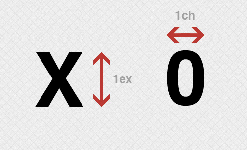
We’re all familiar with px as a font size, but with CSS3 comes the addition of a few new units. You’ve probably heard of the em (1em is equal to the original font-size of the element, 1.1em is 10% bigger) unit, and perhaps some of you have heard of ex (height of the x character).
CSS3 introduces two new font related units. These are ch, which is the width of the font in question’s zero (0) character. The other is rem which is defined as ‘equal to the computed value of ‘font-size’ on the root element’, although the specification is a bit short on details.
View Ports
The viewport is the width and height of the viewable portion of the screen, inside the browser.
There are 3 new viewport related units, which will be incredibly useful for many things. These are vh, vw and vmin.
What it all means
The vw unit stands for viewport width and each unit of vw is equal to 1% of the total viewport width. For example:
div {
     width: 1vw;
}
This would make the div 1% of the total viewport width. It would change as the screen size changed. Similarly, vh stands for viewport height, and each unit is equal to 1% of the viewport height. The final unit, vmin calculates which is smaller, the horizontal viewport width or the vertical viewport height, and then bases its calculations off that. For example, if the height of the viewport was smaller than the width, then 1vmin would be 1% of the viewport height.
This has numerous applications, such as one page layouts, background patterns, and I’m sure a lot more.
Functional Notation
Something new to the whole field of CSS units is the ability in CSS3 to change units in a more fluid manner. These follow functional notation, and are calc(), cycle(), counter() and attr().
How do they work?
As you might expect, calc() allows you to make calculations. For example, lets say you want an element to be the width of the viewport, minus 5 pixels. You could do that like this to accomplish that:
div {
     width: calc(100vw - 5px);
}
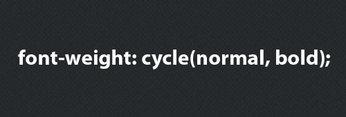
Pretty neat, right? The next function is called cycle(), which literally cycles through elements.
This is used in nested items. Lets assume you have a list, and want each nested set to have a different bullet point. Using cycle this becomes very easy.
li > ul {
    list-style-type: cycle(disk, circle, square, box);
}
So the first nested ul will have disks, the second circles, and so on. The 5th nested ul will have a disk again. Similarly, if you want a div to have bold text, and then its child to have normal text, and so on, you could do something like this:
div {
    font-weight: cycle(bold, normal);
}
Effectively, you end up with a pattern like this:
<div>
    Bold
    <div>
        Normal
        <div>
            Bold
            <div>
                <!-- .. Etc -->
            </div>
        </div>
    </div>
</div>
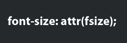
This leads us on to the attr() function, which can grab attributes from the element in question. Lets say you are using the data- HTML5 attribute to attach information to a div via Javascript or some other means. So you have a set of div’s like this:
<div data-font="15"> Hey! </div>
<div data-font="43"> These are divs </div>
<div data-font="23"> That means division </div>
Using the attr() function we can then use these values straight in our CSS:
div {
    font-size: attr(data-font px);
}
This opens up a lot of possibilities and really increases the intimacy between CSS and HTML, allowing us to connect the two in ways we have never really been able to before.
The final element is counter(). Counters allow you to add numbers incrementally, and then put them in your CSS. So first of all you have to reset the counter, then you can increase it, and implement it using counter(). Here’s an example:
ul {
    counter-reset: lists;
}
li {
    counter-increment: lists;
    content: "List Item " counter(lists);
}
To Finish
The list of new units in CSS3 goes on and on, however most don’t have an applicable function just yet, or the specification doesn’t detail exactly what uses they may have. Since the specification is still being refined this is to be expected, and most of these will certainly prove useful in the future.


