With a lot of talk recently over at Mozilla about supporting the Flexbox specification in the near future (in its current iteration anyway), I thought it would be good to cover exactly what the CSS3 Flexible Box Specification can do, and how it’s really going to simplify layout design, as well as changing forever how we do it.
Support
Support for this specification is surprisingly good, with both Webkit and Trident (Internet Explorer) supporting at least some parts of the specification. There are no up to date polyfills at the moment, so we’ll just have to use what’s already implemented in browsers.
| Webkit | Gecko | Trident | Presto | |
| flex | Canary | Soon (Maybe) | None | None |
| flex-align | Platform Preview | |||
| flex-item-align | None | |||
| flex-direction | ||||
| flex-flow | Platform Preview | |||
| flex-line-pack | ||||
| flex-order | ||||
| flex-pack | ||||
| flex-wrap | None |
The slow pace of development in Trident means that webkit is our only real option for an up to date implementation of the flexible box specification.
How Flexible Boxes Work
So I bet now you’re wondering how exactly a flexible box layout works. Flexible boxes allow for divs to align beside each other (previously we used float: left;), and also for divs to fill up the remaining space (instead of using percentages). It basically tackles two of the greatest problems when designing a layout.
First Steps
I’m using Google Chrome Canary and the editors draft of the specification. so we’re going largely by the specification as to what each means. The flex box works by first having a set of elements which are not positioned absolutely inside a container:
<div id="flexbox">
<div class="item1">DIV 1</div>
<div class="item2">DIV 2</div>
<div class="item3">DIV 3</div>
<div class="item4">DIV 4</div>
<div class="item5">DIV 5</div>
</div>
Next we need to set the parent container to flex box mode. We do this via the display property. We can have an inline flexible box or just a regular block kind. For this tutorial we’re going to be using the regular block kind.
We can also define what way we want the boxes to align. We have two main options, column and row, as well as reverse-column and reverse-row. Then we can say whether or not the divs will wrap using flex-wrap. We can set it to either wrap or nowrap (which means that line breaks will not occur when the maximum space is used up). So your CSS should look a little like this: (I’m using webkit specific properties since webkit has the best support)
#flexbox {
	display: -webkit-flex;
	-webkit-flex-flow: row; // Children elements will be in rows
	-webkit-flex-wrap: nowrap;
	width: 100%;
}
The Properties
To understand how the flex box works in more detail, I’ve listed all the flex box properties and how they work.
flex
flex: [positive flex || negative flex || initial width];
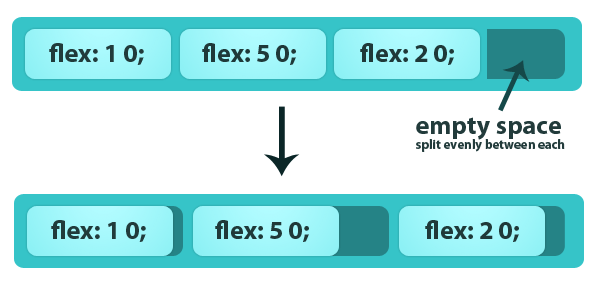
The flex property determines how much a box can flex. There are 3 properties. The positive flex determines how much a box can increase in size. The negative flex determines by how much a box can shrink.
As an example, lets say you have a box that is 500 pixels wide with a bunch of divs inside it. The container div is set to act as a flexible box, but when they’re all lined up with have a gap of 100px! If we set the positive flex for one box as 2, and the positive flex for another box as 3, the first box will take up 2/5 of the extra area (that’s 40px) and the other box will take up 3/5. We get the 5 from adding up all the positive flex values.
The same thing will happen with negative flex, only the other way around (the boxes will shrink). Here’s an example, but for simple stretching you only need to define the positive flex (as in flex: 3). There’s also an image example so you can visualize it.
flex: 2 1 40px;
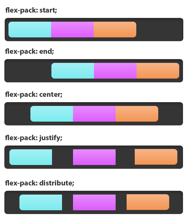
flex-pack
flex-pack: start | end | center | justify | distribute;
Determines how the boxes are aligned horizontally within the container. If you choose start they will all appear on the left, end, they will all appear on the right, and center, they will all appear in the middle. Justify will make the boxes fill the parent element with gaps between them, and distribute will do the same, only leaving gams at either side.
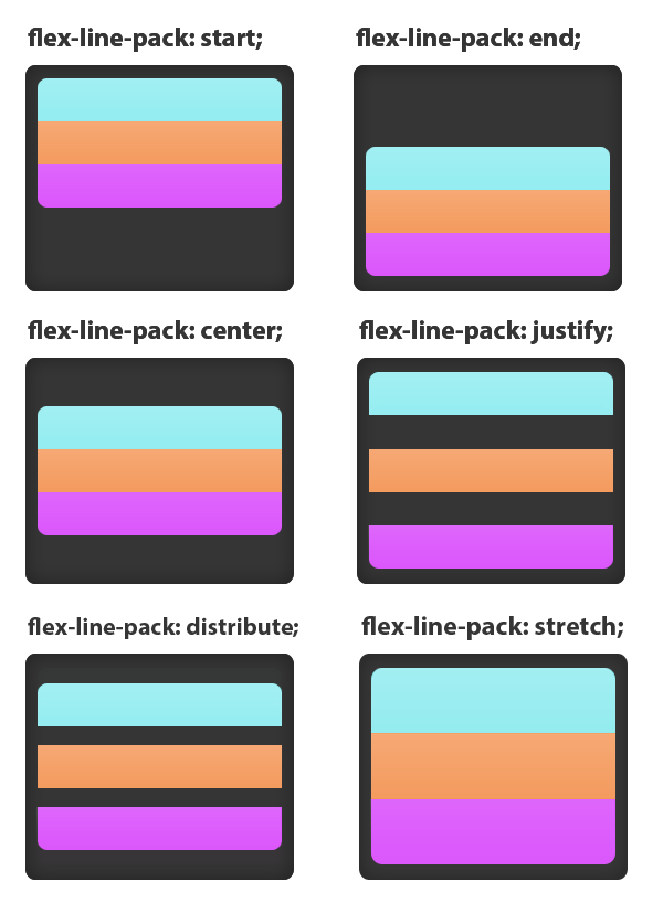
flex-line-pack
flex-line-pack: start | end | center | justify | distribute | stretch;
This is the same as flex-pack, only for vertical boxes as opposed to horizontal. The key words do the same thing as you’d expect, only on boxes on top of each other.
flex-order
flex-order: <number>
This defines the order the elements appear in. This comes in very useful when creating a layout. As an example, you could set the first div to appear in the 4th position, that is to say, the first div will appear as the 4th div.
#flexbox div:first-of-type {
    -webkit-flex-order: 4;
}
Layout Example
So lets say you want to create a layout using flexbox, and you have HTML that looks a little like this:
<div id="header"></div>
<div id="content"></div>
<div id="footer"></div>
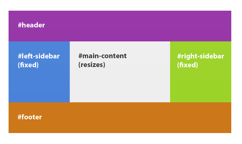
We want the header to be at the top, footer at the bottom, with two fixed columns (the sidebars) and we want the main content to resize to fit. We can easily accomplish this using the flexible box model.
#header {
	background: purple;
	width: 100%;
	height: 200px;
}

#content {
	display: -webkit-flex;
	-webkit-flex-flow: row;
	width: 100%;
}

#content #left-sidebar {
	width: 200px;
	height: 300px;
	background: blue;
}

#content #right-sidebar {
	width: 200px;
	height: 300px;
	background: green;
}

#content #main-content {
	-webkit-flex: 1;
	background: #eee;
}

#footer {
	width: 100%;
	height: 200px;
	background: orange;
}
Because we set the flex of the #main-content to 1, the #main-content div will resize to fill any empty space.
Conclusion
The flexible box CSS specification will certainly change how we make layouts in the near future. Things like floats will be a thing of the past, tied only to article content, rather than whole web designs, which in all honesty was a little unreasonable anyway. Even though support is pretty low on the ground (Webkit is exceptional, as usual), we can expect to see an increase quite soon.


