CSS3 Filters are a quite interesting offshoot from SVG, allowing you to modify HTML elements and images with blurs, brightness and a lot more. In this quick tutorial we’ll go over exactly how they’re going to work.
How it Works
Using just CSS we can accomplish some pretty complicated effects. These should be applicable to both images and HTML elements, but obviously browsers will vary for the foreseeable future. The property used to control all of this stuff is filter.
filter: filter(value);
As you might expect though, browser prefixes will be required. For the moment though, -webkit-
(Chrome and Safari) is the only browser engine supporting these properties.
-webkit-filter: filter(value); -moz-filter: filter(value); -o-filter: filter(value); -ms-filter: filter(value);
Filtering
There are quite a few filter, so to get a better idea lets take a look at them individually. Multiple filters can be applied with a space, for example, brightness and blur:
filter: blur(5px) brightness(0.5);
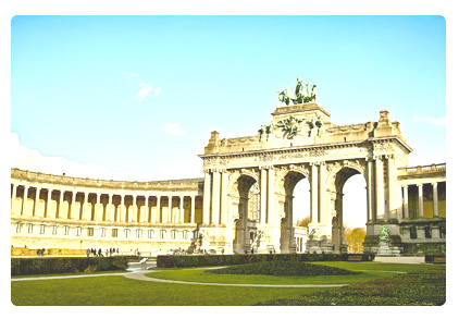
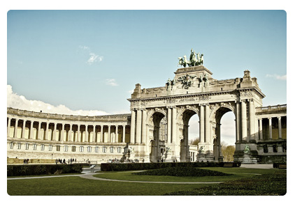
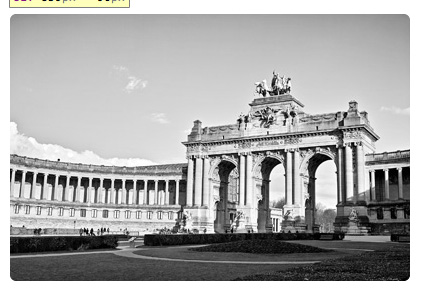
There are a few filters that I won’t outline below, but these can be easily accomplished with already existing CSS (opacity and drop shadows). Here’s the original image which we’re going to filter below:
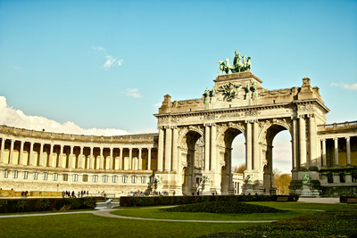
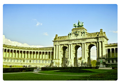
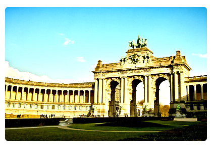
I will provide the filtered version of the photo (the first photo) and a picture of what the filter should look like (the second photo) should you be using a browser that can’t see filters. Enjoy!
Blur
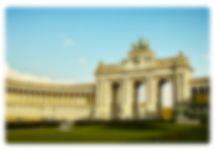
Ever wanted to do a gaussian blur on an image or text with just CSS? Well with filters you can! Blur is measured in pixels, so you might do something like this:
filter: blur(5px); // Browser Specific -webkit-filter: blur(5px); -moz-filter: blur(5px); -o-filter: blur(5px); -ms-filter: blur(5px);
Brightness
Brightness is measured from zero to one, 1 being complete brightness (white) and 0 being the original brightness.
filter: brightness(0.2); // Browser Specific -webkit-filter: brightness(0.2); -moz-filter: brightness(0.2); -o-filter: brightness(0.2); -ms-filter: brightness(0.2);
Saturation
Measured by percentage using the saturate()
keyword.
filter: saturate(50%); // Browser Specific -webkit-filter: saturate(50%); -moz-filter: saturate(50%); -o-filter: saturate(50%); -ms-filter: saturate(50%);
Hue Rotate
This is quite nice, it allows you to alter the hue by rotating it (imagine a wheel of colours which you then rotate). It’s measured in degrees.
filter: hue-rotate(20deg); // Browser Specific -webkit-filter: hue-rotate(20deg); -moz-filter: hue-rotate(20deg); -o-filter: hue-rotate(20deg); -ms-filter: hue-rotate(20deg);
Contrast
Again, measured using percentages. 100% is the default value, 0% will create a completely black image. Anything more than 100% adds contrast!
filter: contrast(150%); // Browser Specific -webkit-filter: contrast(150%); -moz-filter: contrast(150%); -o-filter: contrast(150%); -ms-filter: contrast(150%);
Invert
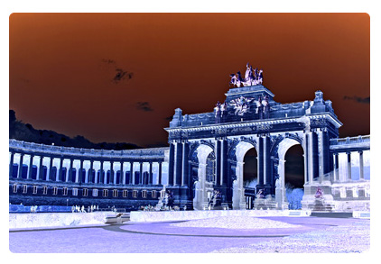
A measure of the amount you wish to invert the image by. Ranges from 0% to 100%. Now strangely, for the moment, webkit does not support inversions if they are less than 100%.
filter: invert(100%); // Browser Specific -webkit-filter: invert(100%); -moz-filter: invert(100%); -o-filter: invert(100%); -ms-filter: invert(100%);
Grayscale
Again, the measure of the amount you wish to grayscale the image by. Ranges from 0% to 100%.
filter: grayscale(100%); // Browser Specific -webkit-filter: grayscale(100%); -moz-filter: grayscale(100%); -o-filter: grayscale(100%); -ms-filter: grayscale(100%);
Sepia
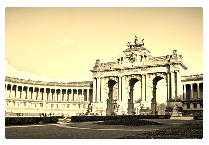
Sepia! I suppose quite useful if you wish to post something on Instagram. Although I suppose you wouldn’t use CSS for that. Anyway, similar to grayscale and invert, it is the amount you wish to add sepia to the image. 100% will be complete sepia, 0% will be the initial image.
filter: sepia(100%); // Browser Specific -webkit-filter: sepia(100%); -moz-filter: sepia(100%); -o-filter: sepia(100%); -ms-filter: sepia(100%);
Support
Last Updated September 12th 2013. Don’t forget, if a browser doesn’t support this it’s not the end of the world. Most of the time a blur effect will not be necessary for the user to use your website, so you can use it! Browsers which don’t support it will simply see nothing.
Feature | Chrome/Safari | Firefox | IE | Opera |
Blur | Experimental | None | None | Experimental |
Brightness | ||||
Saturation | ||||
Hue Rotate | ||||
Contrast | ||||
Invert | ||||
Grayscale | ||||
Sepia |
Comments
I like this code…
it is very useful to us
Very nice and helpful explanation of CSS3 Filters, but you should write the css properties with prefix first and than the css property without prefix! Because older css properties with prefix could overwrite the the resent version without prefix.
Thx for sharing & Greetings from Berlin, Germany!
What’s been in IE for more than a decade in one form or another is being standardized and implemented in CSS3? It’s starting to feel weird how many IE5/6 features are being used nowadays and considered new.
Sure MS’s methods of handling the filters (filter:progid:DXImageTransform.Microsoft.[somefilter]) was lengthy, clunky and odd but I sure hope everyone is giving proper credit to the old IE team for being first to market with several of these features in CSS.
Too bad they had so many other bugs and non-standard behavior for the stuff was actually being regularly used.
But you are absolutely right. They had some forward-looking features in there.
I’m so with you guys. We should start The Righteous Crowd.
Nice Tutorials
Nice tutorials, thanks for sharing.
the code is nice and usefull, i just want to sujest puting the unprefixed version of the filter at the bottom, as it is a better pattern.
Interesting stuff!!
After css3 shadows this is the best one :)
Have you ever read something about CSS prefixes and why prefixed-unprefixed order is that important? Please have a look at this canonical article and change rules order in your examples as unprefixed rule should go last, that’s how prefixes works.
http://www.alistapart.com/articles/prefix-or-posthack/
Here’s the “enhanced” version with properly ordered prefix vendor:
-webkit-filter: grayscale(1);/*not sure about this one*/
-webkit-filter: grayscale(100%);
-moz-filter: grayscale(100%);
-o-filter: grayscale(100%);
-ms-filter: “progid:DXImageTransform.Microsoft.BasicImage(grayScale=1) progid:DXImageTransform.Microsoft.Light()”;/*ie9>*/
filter: progid:DXImageTransform.Microsoft.BasicImage(grayScale=1) progid:DXImageTransform.Microsoft.Light(); /*ie5.5>ie8*/
filter: sepia(100%); /*w3c */
Is there a grayscale to color option?
I’m afraid not.
Finally, we don’t have to use two images for grayscale hovers anymore! Add some transitions and watch the magic happen. Awesome post!
Great to know! Thanks for your article.
Hay,
Thank a lot for this information! Worth to try :)
Can’t wait for the other browser vendors to catch up with Webkit.
Anybody tested this on IE10 ?
Tested this on IE10+, doesn’t work since Microsoft has removed native support for CSS grayscale filter.
But here is a solution that fixes image grayscale problem on IE10+ using JS + SVG http://www.majas-lapu-izstrade.lv/cross-browser-grayscale-ie11/
When it is compatible with webkit only then why you are mentioning other syntax.
-moz-filter: -o-filter: -ms-filter:
They will not work
As of now they won’t work but if other browsers adopt them it will automatically work on the site without having to go back and add in the prefixes.
I was very happy to search for this kind of internet-site.I wanted to interesting here we are at this kind of wonderful learn!! I definitely enjoying every small little bit of it and I’ve a person book-marked to see new stuff you web site publish.
Great goods. Carry on the superb work
Very nice, just what I was looking for at the moment!
Internet Explorer 8 is the last version of Internet Explorer to be supported on Windows XP and Windows Server 2003; the next version, Internet Explorer 9, is supported only on Windows Vista, Windows Server 2008 R2, and Windows 7 operating systems.:-:;
http://www.caramoan.ph
Most up-to-date piece of writing on our own blog page
awesome improvements in CSS3 features. love it!!
hint next time try testing your code as opposed to just regurgitating other devs that don’t test their work.
none of -moz-filter prefixes will work.
you have to do a few more steps for firefox… yes the browser sorta sucks.
Hey there, sorry you feel that I’m just regurgitating what other devs are saying, but I actually researched this quite a bit and to be fair this was one of the first articles on the Filter spec on a web design centered site and is based on data from the W3C specification.
Anyway, I realise that perhaps you are unaware of how emerging standards work so let me clarify that the moz prefixes are there for when firefox implements filters, so that users with that browser will instantly be able to use the filters without needing the further adjust the changing code base which can be hard to follow for even an adept designer.
You’ll also notice that the table at the bottom shows which browsers support the standard. Firefox is not shown as supporting this in the table.
I’d also like to counter your argument that firefox is a bad browser, it’s in fact a very good browser. I use Chrome but Firefox would definitely be my second choice. Have a nice day!
Awesome tutorial. This is the future of CSS technology.
This picture has been taken at the “parc du cinquantenaire” in brussells, belgium. Really nice area.
According to the W3C CSS3 filter specs (http://www.w3.org/TR/filter-effects/#brightnessltnumbergt-ltpercentagegt) brightness works differently versus your description: 0 is black, 100% is original brightness, and going beyond 100% increases the brightness. The example image you have looks like filter: brightness(1.3);
Brightness has changed and this page no longer properly represents it in the pre-rendered example
Hello thanks for such a valuable code buddy likes it i was wondering for such useful code thanks a lot…… :)
This is awesome tutorial! .. today i know with all about CSS filter , thanks so much author , i like your style on posted this tutorial ..
it’s easy
Very interesting but right now is too early to use those effects. Right now I’m serving those effects server-side
I’m looking forward to see that implemented on every browser!
Interesting, when browsers will have the full support of these filters? :)
Very Good Article
thnaks
Awesome!!!!!!!!!!!!!!