In times gone by a web designer had only the properties and values in his head to style a website. Nowadays however, things are a little more complex, and they’re about to get even more so with the CSS Working Group’s conditional CSS statements.
I say almost introductory because you might have heard of these new things called media queries. Media queries are a type of conditional statement where you can style a webpage based on the properties of a user’s computer. For example, one might say the following in their CSS stylesheet:
@media screen and (min-width: 1000px) {

   /* CSS Goes here! */

}
The stuff you put in the curly brackets will only apply to screens with a width greater than 1000px. There are a bunch of other media queries regarding resolution, etc. I’m sure you’re quite familiar with them. What you may not know however is the CSS Conditional Statement Specification also talks about two other CSS conditional statements. Currently these two features are only supported in Firefox (6.0 for @document and 17.0 for @supports)
@supports
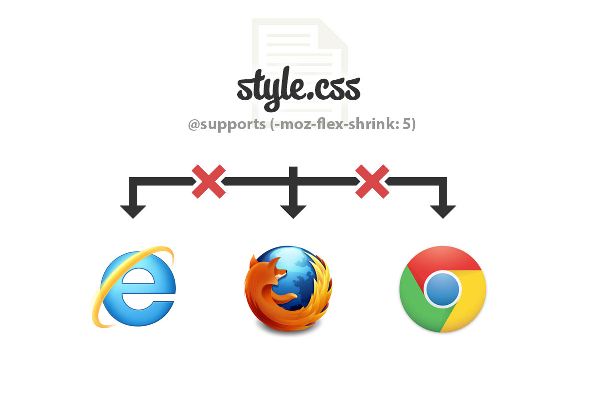
Suppose a particular brand of browser supports a feature, but another doesn’t. You then have a back up CSS script planned for browsers that do not support that particular feature. Well, @supports can help you with that! @supports checks to see if the property you call is supported in the browser.
So lets say (for some reason) you only want CSS to apply to a browser with the CSS flexible box model supported. You might do something like this:
@supports (display: flex) {
    /* Put some CSS here */
}
The CSS in the curly brackets will only be enabled should the browser support the flex box. Then you can have other CSS which overrides that CSS should the browser not support the flex box, i.e.:
/* If flexbox isn't supported, backup CSS goes here */

@supports (display: flex) {
    /* Flexible box CSS goes here */
}
Similar to media queries, you can check for multiple things using or and and.
@supports (display: flex) and (box-shadow: 0 0 10px rgba(0,0,0,0.1)) {
    /* If box shadows and the flex box are supported */
}
@supports ((display: flex) and (animation-duration: 1s)) or ((diplay: flex) and (transition-duration: 1s)) {
    /* If flex box and animation duration are supported, or if flex box and transition duration are supported */
}
Negation
You can check if a browser doesn’t support a feature too using not(). For example, the CSS in the curly brackets below will only be applicable when flexbox isn’t supported:
@supports not(display: flex) {
    /* Back up CSS goes here */
}
@document
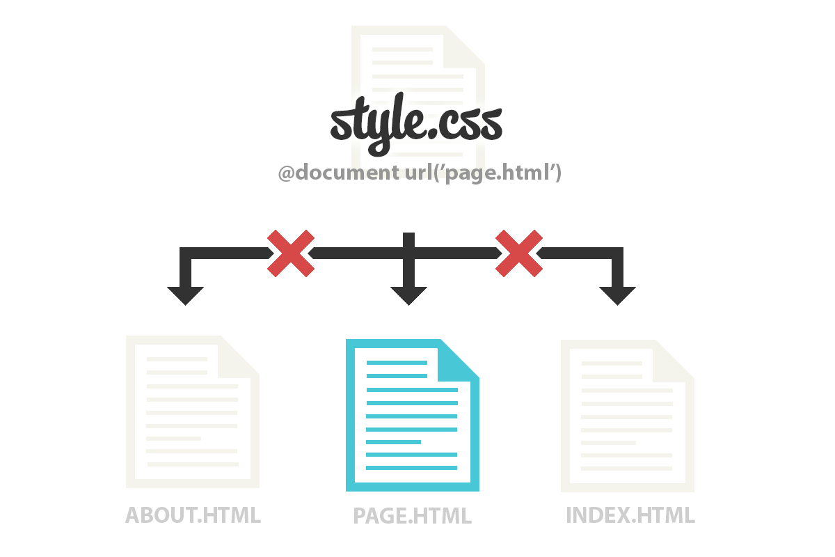
@document styles CSS based on the page you are on. For example, it would be totally possible to do this to target a specific URL with CSS:
@document url('http://www.html5canvastutorials.com/blog/') {
    /* CSS goes here */
}
Or you could apply it to everything in a particular folder:
@document url-prefix('http://www.html5canvastutorials.com/blog/css') {
    /* CSS goes here */
}
The Benefits
Faster loading times
Presumably you can use this little trick to have a single unified header which selects which files to include based more on the user’s browser’s capabilities. For example, lets suppose you have some additional extras (box shadows, border-radius, etc), which are intended for newer browsers. When it comes to IE this can be a big problem because IE doesn’t support a lot of these features but you still have to load the CSS file. Using @supports you could reduce your primary CSS file and include the added extras as necessary in separate CSS files, thus improving page load times.
<link rel="stylesheet" type="text/css" href="style.css" />

<!-- Optional extras -->
<style>

@supports (box-shadow: 0 0 10px rgba(0,0,0,0.1)) {
    @import url('box-shadow.css');
}

</style>
One Stylesheet for everything
Alternatively, you can have one stylesheet for everything since you can load the page specific and support specific CSS within these conditional statements. This is a good idea since the single CSS file will be stored in the user’s cache, so the page will load faster after the first visit.
/* Some regular CSS here */
div {
   ...
}

@supports (display: flexbox) {
    /* If supported, do this CSS */
}

@document url('http://www.html5canvastutorials.com/blog/page.html') {
    /* CSS for specific page */
}

@media print {
    /* Media CSS */
}
Current Support
| Feature | Chrome | Safari | Firefox | IE | Opera |
| @document | None | None | 6.0 | None | None |
| @supports | None | None | 17.0 | None | None |


