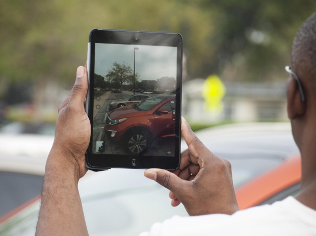
In today’s technology market consumers are being offered devices that have some of the highest resolutions that the tech world has ever seen so far. What a lot of consumers may not know is that designers are having to put in a lot more work when it comes to making sites functional for an HD device.
“High definition devices display images with a higher density of pixels per inch (ppi or dpi, interchangeably),” according to The Next Web.
“Technically, anything greater than 200 ppi is considered high definition. Compare this to the typical standard definition display – the foundation the Internet was built on – which is only 72 ppi.”
Designers have to try to keep their data files light so that they are able to load on HD devices in an efficient manner. According to the report the way 72 ppi visuals look on HD devices is the big driving factor in their discussion. The article does state that there are ways around this issue.
Some of the methods that the reports suggest include, scaling vector graphics, HTML5, CSS3 and Javascript rendering, “still” HD video, unfocused imagery as well as putting fewer visuals on the site to begin with.
“Traditionally, images are rendered in the browser, which is where some of these problems arise,” according to the report.
“If you render your images in HTML (width & height attributes), CSS (properties), or JavaScript (properties), however, you gain more control over how they’re viewed, and can sometimes avoid that unsightly blurriness. The easiest solution is to set the image’s size to be half of what it actually is, so that when converted to HD, it’s displayed normally.”
The explanation above along with details for each of the other four techniques mentioned are all in attempts to make the designers life easier when designing for HD devices.
Read the full story.

